Color Temperature & Light Quality FAQs
Color temperature and light quality shape how a space feels long before we notice the fixtures themselves. A room can be bright enough and still feel cold, flat, or uncomfortable if the color of the light is wrong or the quality is lacking. Terms like Kelvin, CRI, tint, and color rendering are common in lighting conversations, but they are rarely explained in a way that connects to how light actually feels in everyday life.
Before diving in, it is important to clarify scope. The information in this article is general lighting guidance only. It does not describe or evaluate any specific product from Research.Lighting. For details about color temperature, color rendering, or performance of individual fixtures, refer to the respective product pages where those specifications are listed.
This FAQ is meant to give you a working understanding of why light looks the way it does, why some white light feels better than others, and how color temperature and quality influence comfort. Whether you are replacing a single bulb or thinking more broadly about modern lighting throughout a home, these answers provide a practical foundation.

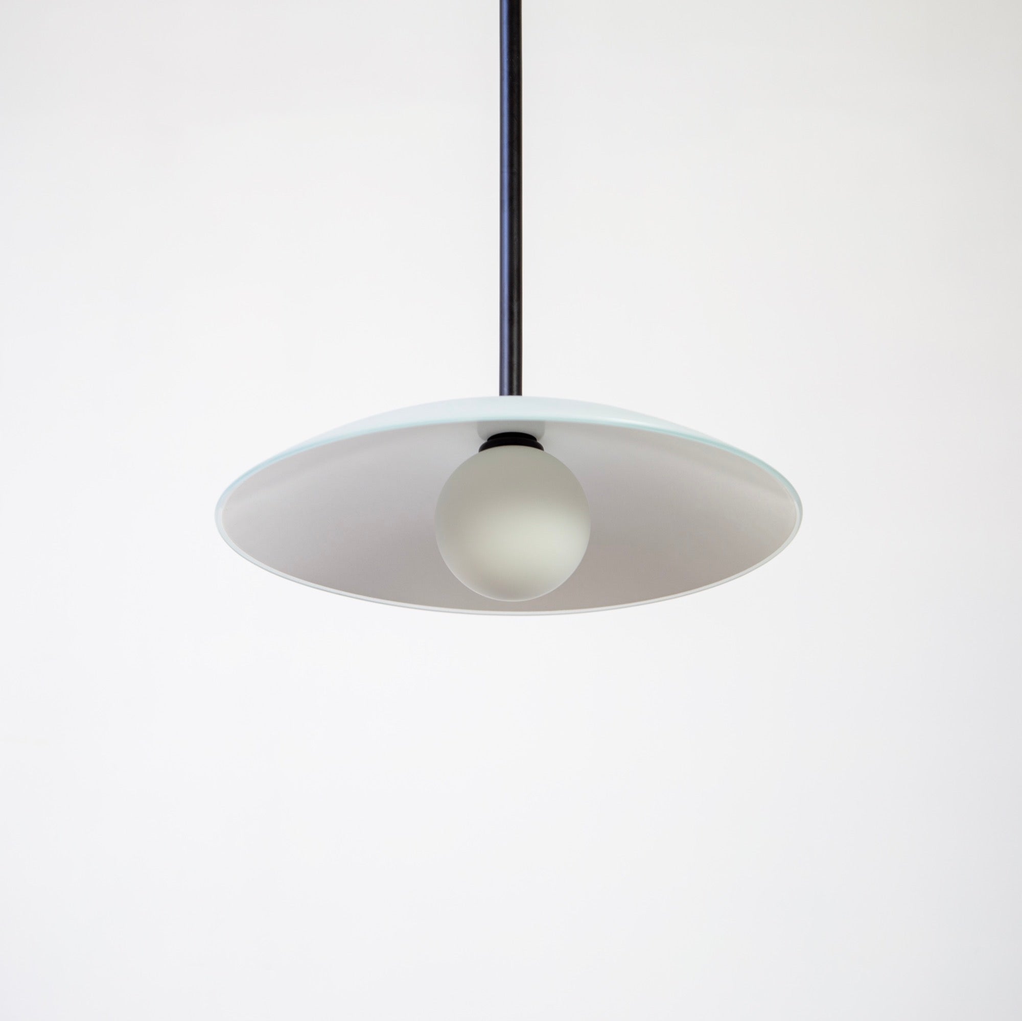
Dish Flush Mount by Research.Lighting
Table of Contents
- Color Temperature Fundamentals
- Color Temperature vs Tint
- Light Quality and Color Rendering
- Consistency, Context, and Daylight
Color Temperature Fundamentals
What is color temperature in lighting?
Color temperature describes the visual tone of white light, ranging from warm to cool, and is measured in Kelvin. Lower Kelvin values appear warmer and more yellow, while higher values appear cooler and bluer. Color temperature does not describe brightness (for that see Lumens Explained: How Bright is Bright Enough?). Instead, it influences mood and perception. Warm light often feels relaxed and familiar, while cooler light can feel sharper or more alert. Choosing an appropriate color temperature is about matching the character of the light to how you want a space to feel and be used.
What does Kelvin (K) mean on a light bulb or fixture?
Kelvin indicates the color appearance of a light source. It is based on the color a theoretical blackbody would emit when heated to a certain temperature. In practical terms, Kelvin tells you whether a light will look warm, neutral, or cool. A lower number means warmer light, and a higher number means cooler light. Kelvin does not describe quality or brightness, but it sets expectations for the light’s overall tone.
What is the difference between warm, neutral, and cool white light?
Warm white light has noticeable yellow or amber undertones and tends to feel inviting and relaxed. Neutral white sits between warm and cool and feels balanced without strong color bias. Cool white has a bluish cast and feels crisp and precise. Each creates a different emotional response. Warm light softens a space, neutral light keeps things clear and calm, and cool light emphasizes contrast and sharpness.
What Kelvin range is considered warm white?
Warm white typically falls between about 2200K and 3000K. At the lower end, the light feels candle-like and amber. Toward the upper end, it becomes cleaner while still reading as warm. Most residential interiors use warm white because it is flattering and comfortable, especially in the evening. The exact preference varies, but anything under 3000K generally reads as warm.
What Kelvin range is considered neutral white?
Neutral white usually ranges from roughly 3000K to 3500K. It reduces the yellow tone found in warmer light while avoiding the blue cast of cooler light. Many people find neutral white versatile, especially in spaces used throughout the day. It provides clarity without feeling harsh and often renders colors more evenly than very warm light.
What Kelvin range is considered cool white?
Cool white generally starts around 4000K and above. It appears crisp and blue-leaning, with higher contrast and edge definition. While common lighting commercial environments, cool white can feel stark in residential settings if used broadly. Some people like its clean look, but others find it uncomfortable at night. Cool white tends to emphasize precision rather than warmth.
What does “daylight” mean in lighting terms?
In lighting, “daylight” usually refers to color temperatures between about 5000K and 6500K. These values mimic midday outdoor light, which appears bright and blue. Indoors, daylight color temperature often feels unnatural unless used intentionally. Natural daylight changes throughout the day, while electric daylight remains static, which is why daylight-labeled bulbs can feel harsh in interior spaces.
What is the difference between 2700K and 3000K?
2700K is warmer and more amber, closely resembling traditional incandescent light. It feels soft and familiar. 3000K is still warm, but cleaner and less yellow. The difference may sound small, but it is noticeable on white surfaces and when lights are side by side. Choosing between them often comes down to whether you prefer a cozy glow or a slightly crisper look.
What is the difference between 3000K and 3500K?
3000K feels warm and residential, while 3500K moves closer to neutral. At 3500K, whites appear cleaner and yellow tones recede. Some people appreciate the clarity, while others find it less relaxing. The shift from 3000K to 3500K is more noticeable than many expect, especially in the evening when cooler light can feel more pronounced.
Is higher Kelvin always better or more modern?
No. Higher Kelvin does not automatically mean better or more contemporary. Many modern interiors use warm or neutral light to balance clean lines with comfort. A space lit at 2700K or 3000K can feel just as modern as one lit at 4000K, if the lighting is consistent and intentional. Quality and cohesion matter far more than pushing toward cooler temperatures.
Can two lights with the same Kelvin look different?
Yes, and this happens often. Kelvin describes general color temperature but does not account for tint, color rendering, or spectral balance. Two lights labeled 3000K can differ in how green, pink, or neutral they appear. Manufacturing differences, binning, and phosphor blends all play a role. This is why matching by Kelvin alone does not guarantee a visual match.
How much variation in Kelvin is noticeable to most people?
Most people notice differences of about 100 to 200 Kelvin when lights are viewed side by side. Variations become especially noticeable on white walls and ceilings or when fixtures are close together. When lights are isolated, the eye adapts quickly and smaller differences are less obvious. Consistency matters most in open or connected spaces.

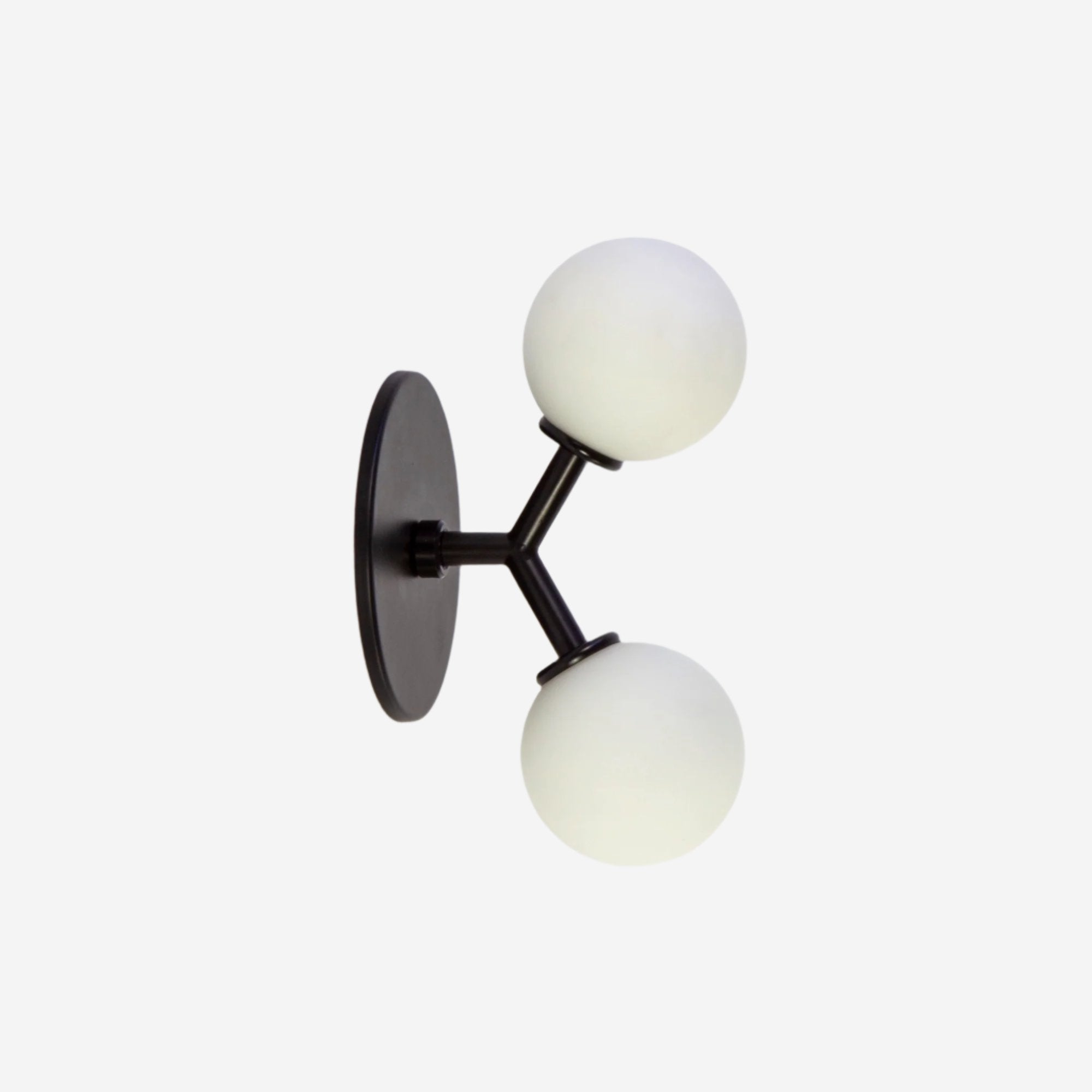
Cone 2 Sconce by Research.Lighting
Color Temperature vs Tint
Why does my white light look green?
A green cast is almost always a tint issue rather than a color temperature problem. Many LEDs have a slight green spike in their spectrum, especially at lower quality levels. This becomes very noticeable on white surfaces. Green tint often makes spaces feel dull or sickly, even if the Kelvin seems correct. It is one of the most common reasons people dislike certain LED lighting.
Why does my white light look pink or magenta?
A pink or magenta cast happens when light shifts in the opposite direction of green tint. Some people actually prefer a slight pink bias because it can feel warmer and more flattering to skin tones. Too much magenta, however, can distort neutral colors. Tint balance is subtle, but it has a strong effect on how natural white light appears.
What is tint in lighting?
Tint describes the green or magenta bias in white light. While color temperature defines how warm or cool the light is, tint describes whether that white leans green or pink. Two lights with the same Kelvin can have very different tint. Tint plays a major role in perceived light quality and comfort, even though it is often overlooked.
How is tint different from color temperature?
Color temperature moves along a warm-to-cool scale. Tint moves perpendicular to that scale, toward green or magenta. Both influence how white light looks. A light can have the correct Kelvin and still look wrong if the tint is off. Understanding this distinction explains why some lighting feels unpleasant even when the color temperature seems right.
What is Duv, and why does it matter?
Duv measures how far a light’s color deviates from a neutral white reference. Positive values indicate greenish tint, while negative values indicate pinkish tint. Values close to zero appear most neutral. Although technical, Duv helps explain why some lights feel clean and others feel off. Slightly negative or near-zero Duv is often preferred in residential lighting.
Why do some whites look gray or dull instead of clean?
Dull whites often result from poor color rendering or incomplete spectral balance. When certain wavelengths are missing, surfaces lose depth and saturation. Tint issues can worsen the effect. Even with sufficient brightness, poor spectral quality makes colors feel flat. Good light restores subtle contrast, making whites feel fresh rather than lifeless.
How can I tell if the problem is Kelvin or tint?
If the light feels too yellow or too blue, Kelvin is likely the issue. If it feels sickly, greenish, or oddly pink, tint is probably the cause. Looking at white surfaces or comparing two lights side by side makes this easier to diagnose. Knowing the difference helps avoid replacing lighting unnecessarily.
How can I avoid that greenish LED look indoors?
Look beyond Kelvin and consider overall light quality. Fixtures with good color rendering and controlled tint are less likely to appear green. Consistency across fixtures also helps, since mixing sources can exaggerate differences. While specifications provide clues, seeing light in person whenever possible is the best way to avoid unwanted tint.

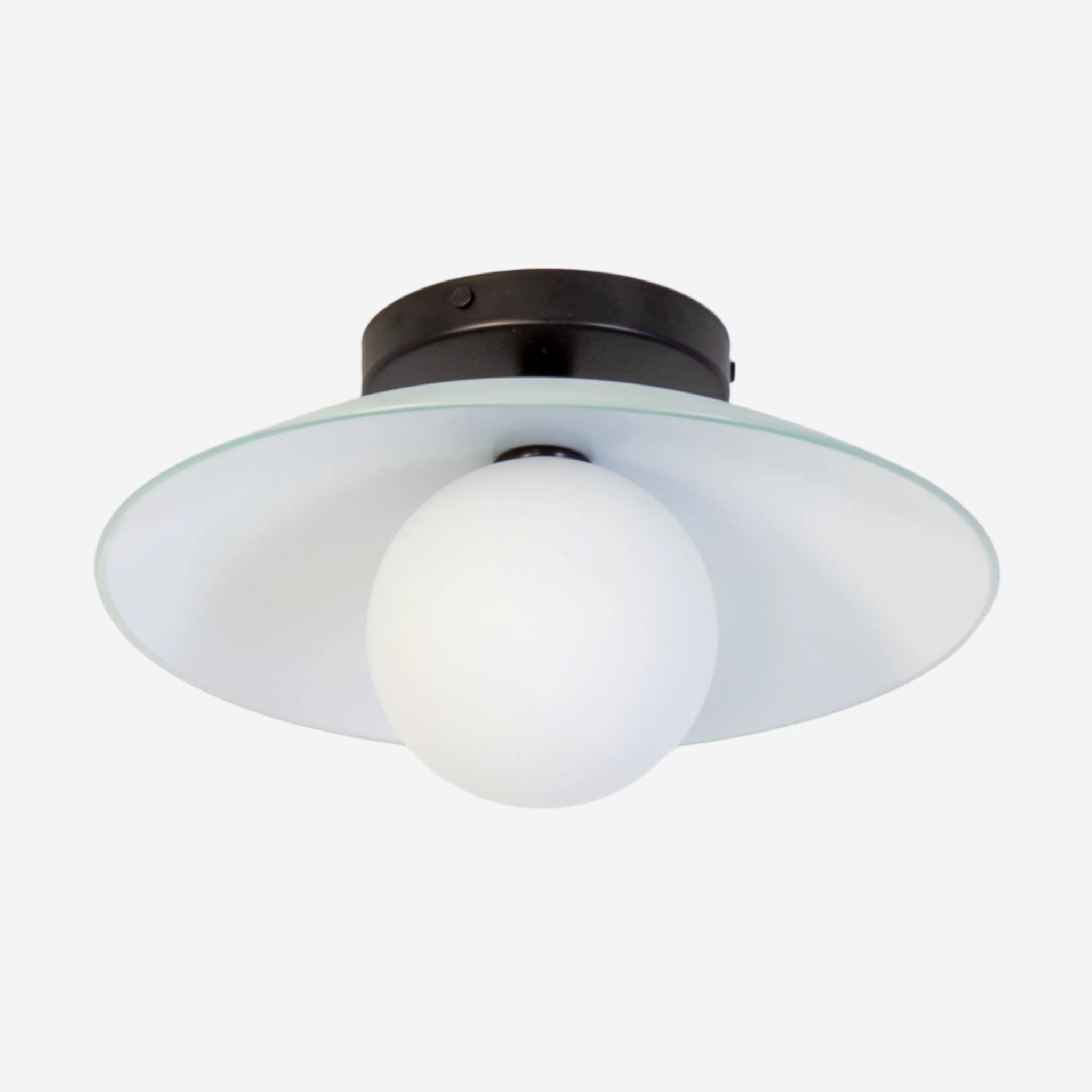
Loop Sconce by Research.Lighting
Light Quality and Color Rendering
What does “light quality” actually mean?
Light quality describes how natural, comfortable, and convincing light feels. It includes color temperature, tint, color rendering, and spectral balance. Good light quality makes materials look believable and people look healthy. Poor quality light can feel harsh, flat, or artificial, even when brightness and Kelvin appear correct. Light quality is about experience, not just measurements.
What is CRI?
CRI, or Color Rendering Index, measures how accurately a light source reveals colors compared to a reference. It is scored from 0 to 100. Higher values indicate more accurate color appearance. CRI is useful, but limited. It averages performance across colors and does not fully reflect how reds or skin tones appear, which are often the most sensitive areas.
Is CRI the same thing as color temperature?
No. Color temperature describes the color of the light itself. CRI describes how that light affects the appearance of colors. A light can be warm or cool and still have high or low CRI. Both need to be considered together for lighting that feels both appropriate in tone and pleasing in appearance.
What CRI is considered good for residential lighting?
A CRI of 90 or above is generally considered good for residential spaces. At this level, colors appear natural and skin tones look healthy. Lower CRI lighting may work in purely functional areas but often feels flat at home. High CRI becomes especially important where people spend time or where materials and finishes matter.
Why do some lights make skin tones look bad?
Poor skin tone rendering usually comes from weak red content in the light spectrum. This is often reflected in low R9 values. When reds are underrepresented, skin can look gray or tired. Balanced spectral output restores warmth and depth, making faces look more natural and alive.
What is R9 and why does it matter?
R9 measures how well a light renders strong red tones. It is not included in the average CRI score but has a large impact on how skin, wood, and warm materials appear. Many people who dislike LED lighting are reacting to poor R9 performance without realizing it. Higher R9 generally means richer, more lifelike color.
Can a light have high CRI and still look wrong?
Yes. CRI averages performance and can hide weaknesses in specific colors or tint. A light may score well overall but still have poor red rendering or an unpleasant tint. This is why CRI alone does not guarantee good light. Real-world appearance depends on multiple factors working together.
What is TM-30 and why does it exist?
TM-30 is a newer method for evaluating color rendering. It separates accuracy from saturation and provides a more detailed picture of how colors shift under a light source. TM-30 helps explain why two high-CRI lights can look very different. While more complex, it offers deeper insight into light quality.

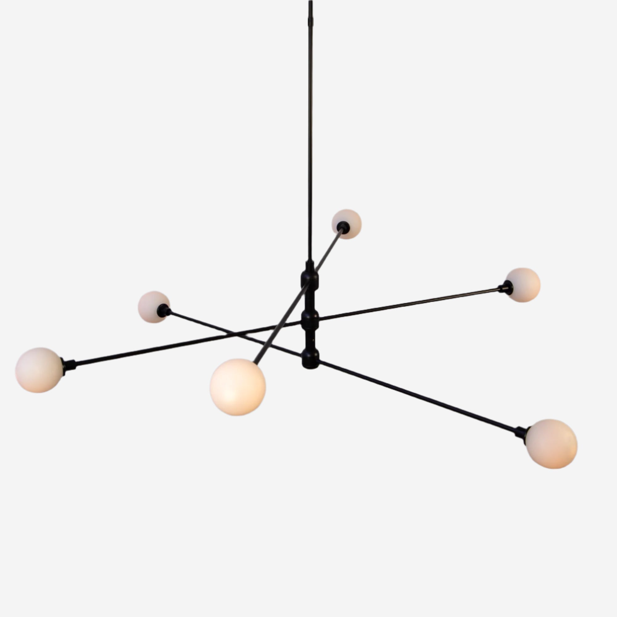
Deep Flush Mount by Research.Lighting
Consistency, Context, and Daylight
Why doesn’t my new bulb match my existing lighting?
Differences in Kelvin tolerance, tint, color rendering, and spectrum all contribute. Even bulbs labeled with the same Kelvin can vary noticeably. Aging and degradation can also change how older bulbs appear. Matching is easiest when using the same product line, but small differences are still common.
Should all lighting in a home use the same Kelvin?
Not necessarily. Consistency within connected spaces matters more than uniformity throughout an entire home. Some variation can feel natural when transitions are intentional. Problems arise when differences are abrupt or accidental. Cohesion matters more than matching everything exactly.
How does daylight affect perceived color temperature?
Daylight changes throughout the day, which influences how electric lighting appears. A fixture that feels perfect at night may feel warm during the day. This interaction is normal. Choosing a balanced Kelvin helps reduce extremes, but some variation is unavoidable when daylight is present.
Why does lighting look different in photos than in person?
Cameras interpret white balance differently than human eyes. Phone cameras often exaggerate warmth or coolness, making lighting appear more extreme than it feels in person. Always trust how lighting looks to your eyes rather than how it appears in photos.

Dish Flush Mount by Research.Lighting
Conclusion
Color temperature and light quality shape comfort, mood, and how materials and people appear in a space. Understanding the difference between Kelvin, tint, and color rendering explains why some lighting feels right and other lighting never quite does.
By focusing on quality as well as color temperature, and by paying attention to consistency and context, lighting choices become clearer and more intentional. When selecting specific fixtures, always consult product pages for detailed specifications, and use this guide as a foundation for asking better questions about the light you bring into your home.
Up next; check out Dimming & Lighting Controls FAQs: How LED Dimming Actually Works, Pendant Lighting FAQs; Sizing, Placement, Style, and Everything Else or The Ultimate Guide to Modern Lighting.